


Despite advancements in digital technology, individuals with disabilities still face significant barriers to accessing opportunities. As digital platforms increasingly serve as essential channels for accessing products and services, it’s crucial to prioritize accessibility principles to mitigate inequalities. Web accessibility is therefore a key issue to be taken into account at every stage of the software development cycle.
As experts in web platform development, we prioritize integrating accessibility principles into every project we undertake. In this article, our business analysts detail actionable steps to improve platform accessibility, offering insights from theory to implementation.
Understanding Accessibility Principles for Effective Implementation
To navigate accessibility challenges effectively as a business analyst, developer, or quality expert, understanding accessibility principles is essential. Training is therefore an essential preparatory step, ensuring that one is well-equipped for the project, and that the right reflexes are developed afterward.
The Web Content Accessibility Guidelines (WCAG) resources, which may at first seem a little arid, are a gold mine of information. Online training courses offered by Udemy and A11y Collective, among others, provide a better understanding of the context and challenges of accessibility and offer content tailored to different audiences.
Integrating Accessibility into Software Development
To develop accessible applications, prioritizing the design of an inclusive user experience is essential.
Contextual Understanding and Prototyping for Accessibility
First and foremost, understanding the customer’s context of use and accessibility principles is crucial. This includes considerations such as users’ reliance on screen readers, average age, or preference for keyboard navigation. This information not only helps in identifying potential accessibility issues but also ensures that the solution adds value for them.
Next, we proceed to a significant stage of the project: creating mock-ups. This involves researching sites and functionalities designed with accessibility in mind to establish a repository of patterns and design elements for use in the mock-ups. The goal is to draw visual inspiration from these examples and the customer’s requirements to provide a general overview of the application’s appearance.
Designing Graphical Interfaces with Color Accessibility
When designing mock-ups and developing the application, various considerations come into play, particularly in crafting the graphical interface, including color choices.
Color Selection
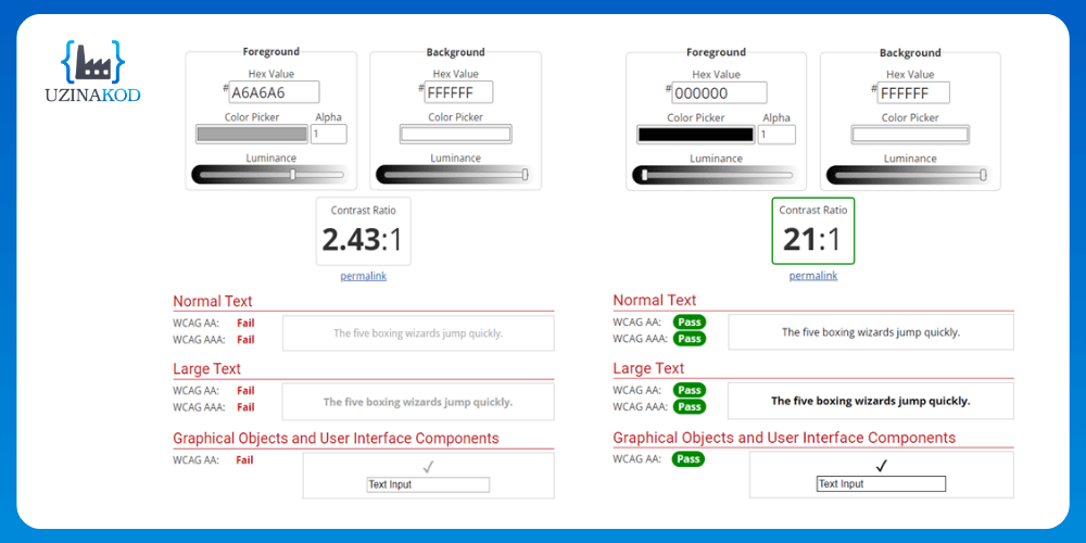
Choosing colors is crucial and should align with both the customer’s preferences and accessibility principles, particularly regarding contrast. If the customer provides a style guide, it serves as a foundation for determining the application’s primary color palette. Subsequently, an analysis of color contrast ensures the use of appropriate combinations, aiming for at least an AA rating in accessibility standards.
Contrast refers to the distinction between text and background colors. Insufficient contrast can hinder legibility for readers with visual impairments. Here’s an example of inadequate contrast:
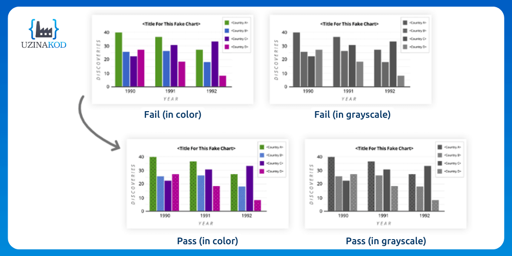
Grayscale Testing
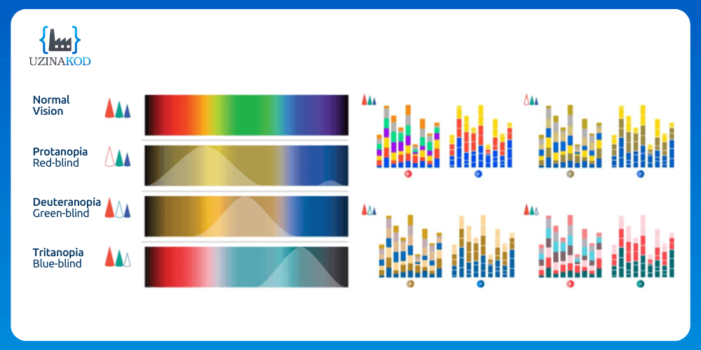
Color blindness is a prime example of a disability that can be challenging to detect through casual observation. To ensure inclusivity in visuals, a grayscale test is employed to reveal elements that may become indistinguishable once colors are removed. This test simulates monochromatism, mimicking the experience of seeing in black and white.
Color blindness stems from a vision disorder affecting one or more of the cones responsible for color perception. The following graphs illustrate three common forms of color blindness: Protanopia (difficulty seeing red), Deuteranopia (difficulty seeing green), and Tritanopia (difficulty seeing blue).
Did you know that…
A 4.5:1 contrast ratio was selected to accommodate for the reduced contrast sensitivity often observed in users with vision impairments equivalent to approximately 20/40. This visual acuity level is common among individuals around the age of 80.
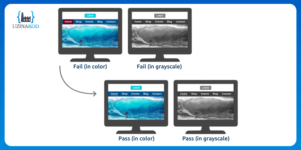
Here’s an example of a blue and red menu that appears suitable for a person with normal vision. However, upon grayscale testing, it becomes evident that the color choices are suboptimal. Therefore, underlining the active section of the menu ensures accessibility standards for all users.
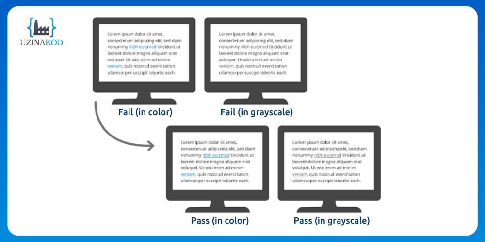
Similarly, the example below demonstrates web links, typically shown in blue within text. For visually impaired users, underlining them enhances contrast without relying on color. When links appear without surrounding text, we suggest using bold formatting.
As far as graphics are concerned, a mix of colors and patterns is an excellent option to ensure that understanding is the same for all readers.
The Importance of Link Legibility and Accessibility
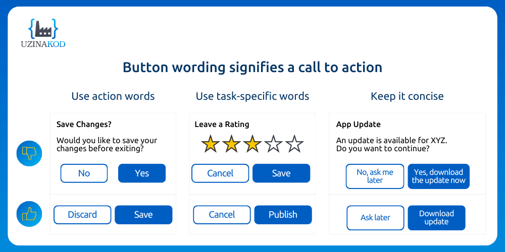
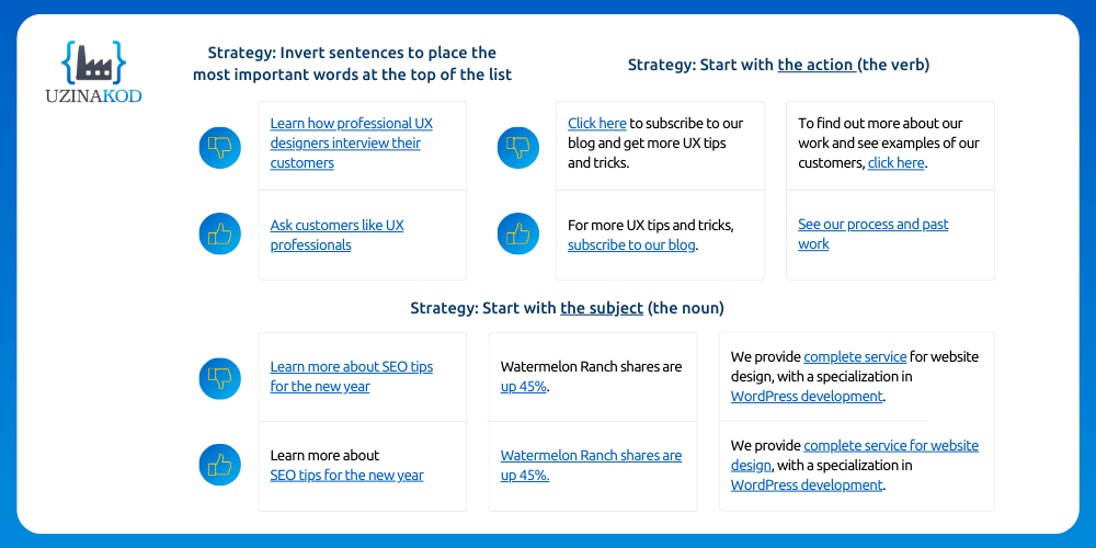
Certain details can significantly influence the usability of a product for individuals with disabilities. Like many other domains, best practices continually evolve, including how certain buttons are labeled. For example, the “Click here” button can pose challenges for screen readers. To improve application accessibility, links should provide additional context, informing users about the action associated with the button. For example, replacing “Click here” with a brief description of the content or functionality.
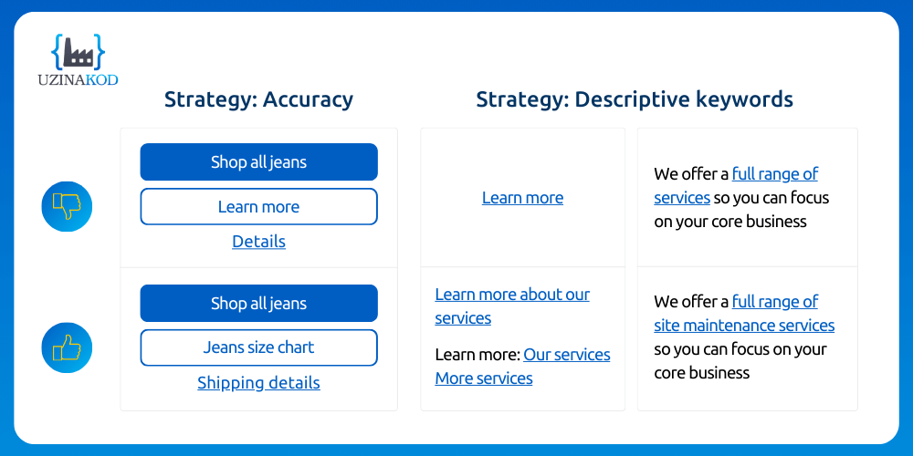
Naming a button might appear unimportant, but selecting the right name can significantly enhance the user experience.
In the same line of idea, users have specific expectations when they read the name of a link and the page it redirects to.
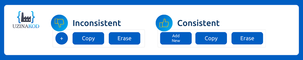
Another aspect of accessibility involves presenting each component consistently. Here, we ensure consistency in the form that buttons will take throughout the project.
Principles of Accessible Development
Beyond the visible elements, certain aspects must be defined in the code to ensure accessibility for screen reader users and keyboard navigation.
A common example is images. While they enhance content, they can hinder understanding if accessibility principles aren’t followed. The “alt” tag, representing alternative text for images, is crucial. It describes the image if it contributes to understanding the context or usage of the application. On the contrary, if an image is purely decorative, the “alt” tag can be left empty.


Generally speaking, the concept is to use specific tags to clarify what the wording or type of element won’t convey to the user, thereby enabling smooth navigation through the application.
To streamline the adoption of best practices, code analysis tools like SonarCloud incorporate accessibility validations. These validations alert developers if structural elements or tags are missing or misused.
Lastly, after functionalities are developed and deployed, accessibility tests conducted by one of our quality experts (as detailed in the previous article in our series) provide a final validation. This occurs before handing over the application to the customer for acceptance testing under real-life conditions.
Your Partner for Accessible Application Development
In conclusion, this article highlights that ensuring the accessibility of an application, whether web-based or mobile, entails more than just a single development stage, it constitutes a distinct process. Each member of the delivery team, alongside the customer, plays a vital role by engaging in training, understanding the context of use, and adhering to accessibility principles.
In software development, as in broader society, it’s the collective involvement of all stakeholders that will break the barriers individuals with disabilities face, ensuring equitable access to products and services for everyone.
Do you have a web platform in need of accessibility optimization, or are you considering application development? Contact our experts today to discuss your project.
Images source: Udemy